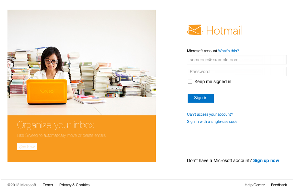
Microsoft just released their new web mail, Outlook.com, which heavily based on their awesome Metro UI Modern UI, and it’s so smooth and responsive compared to the old version.
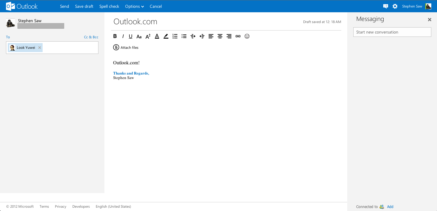
Everything looks so gorgeous now (except those spams migrated nicely to my new inbox), the function bar (which I name it) now placed on top and bigger and easier to use. Clicking on the smiley face icon on the top right corner will bring up the chat panel on the right. I still not able to get it to show list of my friends who are currently online (at the time I’m testing it, and I just test it on my offline contact), though I can get to them by typing their name in the box. The new chat box also looks nice, but they seems like removed some icon, like the (h5) high five icon.
Composing email now made it even more easy to the eyes compared to the previous version.
Overall design of the new Outlook.com is amazing, so does the Metro UI, though it gave me some familiar feel with the Google+ and new Gmail interface — big plain blocky button.
It’s too late for it to be my primary email account now, but it would be a nice secondary email use to sign up account or use to contact with some unknown contacts, to reduce spam chances on my new Gmail address.
Update:
Seems like whenever it loading the interface or new mail/chat message, the whole thing will get super laggy for a laptop that running on Intel graphics.
Beside not able to show (or I just couldn’t figure out how) to display my online contacts on the messenger, it also didn’t change the browser title to notify me new messages like old Hotmail does, instead it showing the count on the small icon on the top right corner. This feature is useful for people that working on other window and does not have access to speaker for sound notification.


